New Year, New Dashboard Studio Features: What's New in 8.2.2201
Platform Lizzy LiTwo major themes to expect from Dashboard Studio features this year are interactivity (think: tokens support) and expanded visualizations. We're kicking off this year with the following improvements in Splunk Cloud Platform 8.2.2201:
-
Ability to specify default values for dynamic tokens
-
New & improved visualizations:
- New Link Graph visualization
- Single Value Radial has an updated look and feel, with the option to define the maximum value
- Updated Bubble and Scatter chart are now available
- New options to set the font and background color for Markdown
-
Refreshed Examples Hub landing page
-
Performance improvements when there are many objects on the dashboard
-
Updated actions menu on visualizations
Default Token Values From Visualizations
At .conf21, we introduced the ability to set tokens by clicking on visualizations. You can learn more about this in our blog Dashboard Studio: New Features Highlighted At .conf21.

Starting in Splunk Cloud Platform 8.2.2201, you will be able to set default values for these tokens and use them in "Link to Custom URL". Let's take a look at the role default token values play in dashboards.
Typically, tokens from visualization interactions don't have a value set until a user actually interacts with the visualization. In the example above, token1's value will be set as the sourcetype of the bar that is clicked. However, before a user interacts with the visualization, token1 doesn't have any value associated with it. If token1 is being used in another visualization, that visualization will be unable to render while waiting for token1 to have a value applied. It might look something like this:

When you specify a default value, it will apply that value to the token, until another value is set by user interactions. You can specify the default value in the Configuration panel. Visit our docs to learn more about setting tokens from visualization interactions.

Once you specify the default value, the dashboard will load with the default value applied. You can still update the token value by interacting with the visualization.

Two other notable tokens enhancements include the ability to use tokens from visualization interactions in custom URL drilldowns, and improved handling of multi-select token values so that you can use strings with spaces.
New and Improved Visualizations
Link Graph is a brand new visualization available in Splunk Cloud Platform 8.2.2201. Link Graph is great for showing relationships between multiple fields. Visit our documentation to learn more about how to set up a Link Graph in Dashboard Studio.

Single Value Radial has also been updated for an modernized visual aesthetic and dynamic coloring, similar to Single Value and Single Value Icon. With this update, you can also specify a maximum value other than 100 (which is the default) in the source code using the option maxValue.

Updated Bubble and Scatter charts have been released as splunk.bubble and splunk.scatter. The new splunk.type visualizations are designed to provide more flexibility with regards to configurations and data binding, so we encourage you to update your visualizations. You can do so by simply selecting the updated visualization from the chart type selector in the Configuration panel.

Last but not least, the markdown component has two new options for specifying text and background color.

Refreshed Examples Hub Home Page
The Dashboard Studio Examples Hub is a great place to find different configuration options or get inspiration from a full dashboard example. As the number of examples included grows, we want to make sure it's still easy to navigate and find the relevant examples you're looking for. In Splunk Cloud Platform 8.2.2201, we've refreshed the Examples Hub home page for a smoother navigation through all our examples!

Other Dashboard Studio Updates
The Splunk dashboards team loves to see the dashboards you are building and hearing your feedback, especially when you're pushing Dashboard Studio to the limits! We've heard feedback about dashboards with 100+ objects to provide data-dense single pane of glass views. In response, you'll notice some performance improvements in this release that makes editing dashboards a snappier experience.
One final update to share is the new placement and behavior of the visualizations action menu. Previously, you had to click on the visualization to see the action menu on the right side. Now, when you want to edit a visualization panel or interact with it while viewing the dashboard, you'll see the actions menu appear below the visualization while hovering.

Coming Soon
Check out Dashboard Studio and send in your feedback through Splunk Ideas, and you might see your feature request listed on a future blog's "coming soon" list! We are continuing to work on new capabilities, which are delivered incrementally with Splunk Cloud Platform and Splunk Enterprise releases.
- Search based tokens
- New map capabilities
- New drilldown options
Helpful Resources
- Dashboard Studio Tutorial
- Dashboard Studio Tech Talk
- Splunk Dashboard Studio Documentation
- Splunk Ideas - Dashboard Studio for feature or enhancement Requests
- Examples Hub - Find the Examples Hub from the Dashboards page in Search & Reporting
- Splunk Community - Dashboards & Visualizations for questions
* This information is subject to change at any time, at the sole discretion of Splunk LLC and without notice. This roadmap information shall not be incorporated into any contract or other commitment. Splunk undertakes no obligation to either develop or deliver any product, features, or functionality described here.
Related Articles

New Cloud-Enabled Features for Splunk Enterprise Customers via Cloud Connect
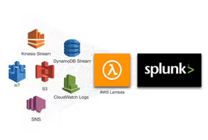
Announcing new AWS Lambda Blueprints for Splunk