
Digital Resilience Pays Off
Download this e-book to learn about the role of Digital Resilience across enterprises.
Welcome to Episode 3 of the Dashboard Digest series! At Splunk we love to eat our own dogfood so in this episode we will see a dashboard showing energy and water usage at Splunk headquarters in San Francisco! Additionally you’ll see a few new custom visualizations that became available for use in Splunk 6.4 as well as use of the Machine Learning Toolkit.
Purpose: Display and analyze building energy and water usage. Use machine learning to forecast energy usage, detect outliers and look for anomalies.
Splunk Version: Splunk 6.4 and above
Data Sources: Sensor data in JSON format coming from Aquicore devices.
Apps: Machine Learning Toolkit, Water Gauge Visualization, Calendar Heatmap Visualization
Summary of tips/tricks used:
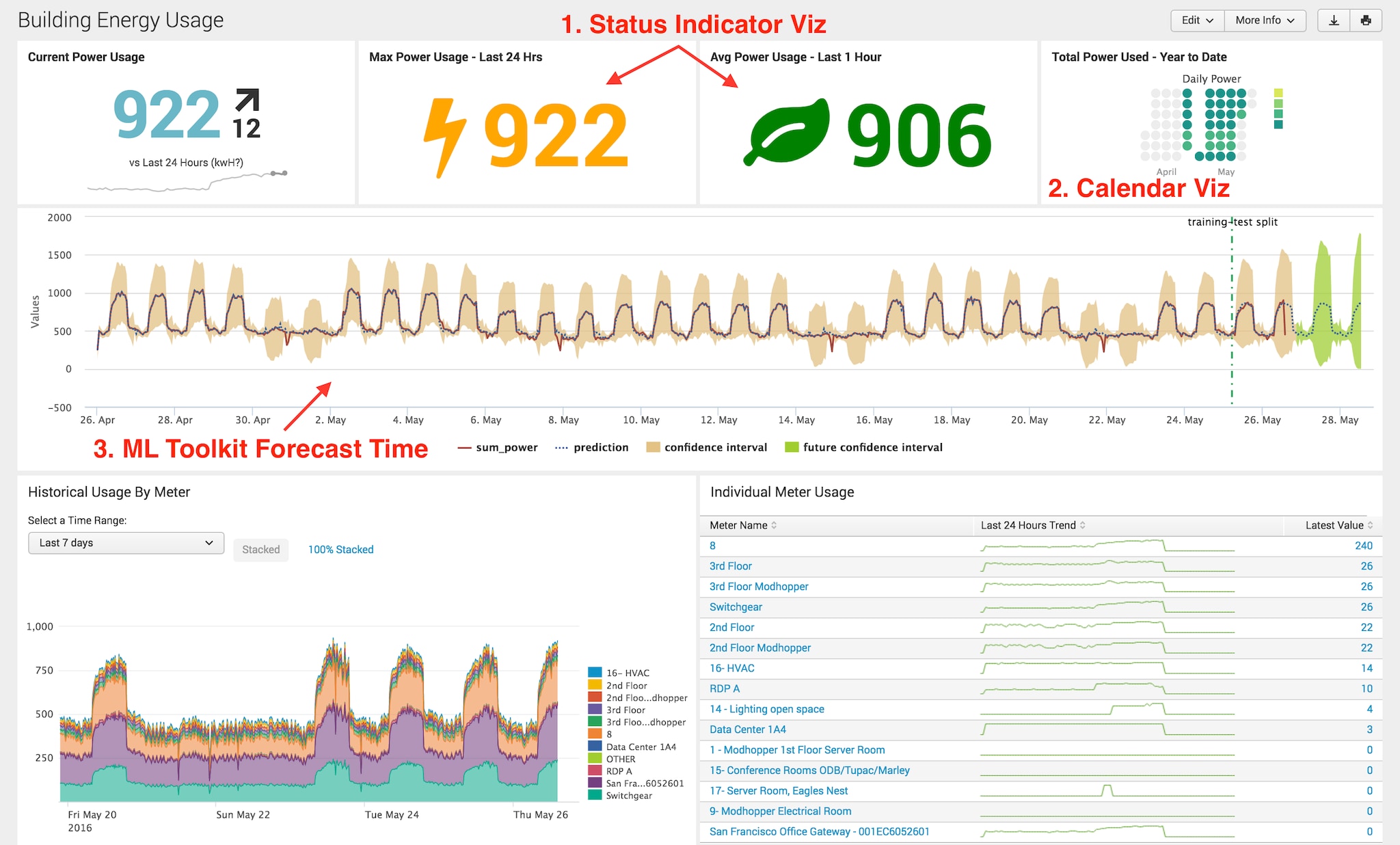
1. Status Indicator Visualization
2. Calendar Heatmap Visualization
3. Machine Learning Toolkit – Forecast Time Series Chart
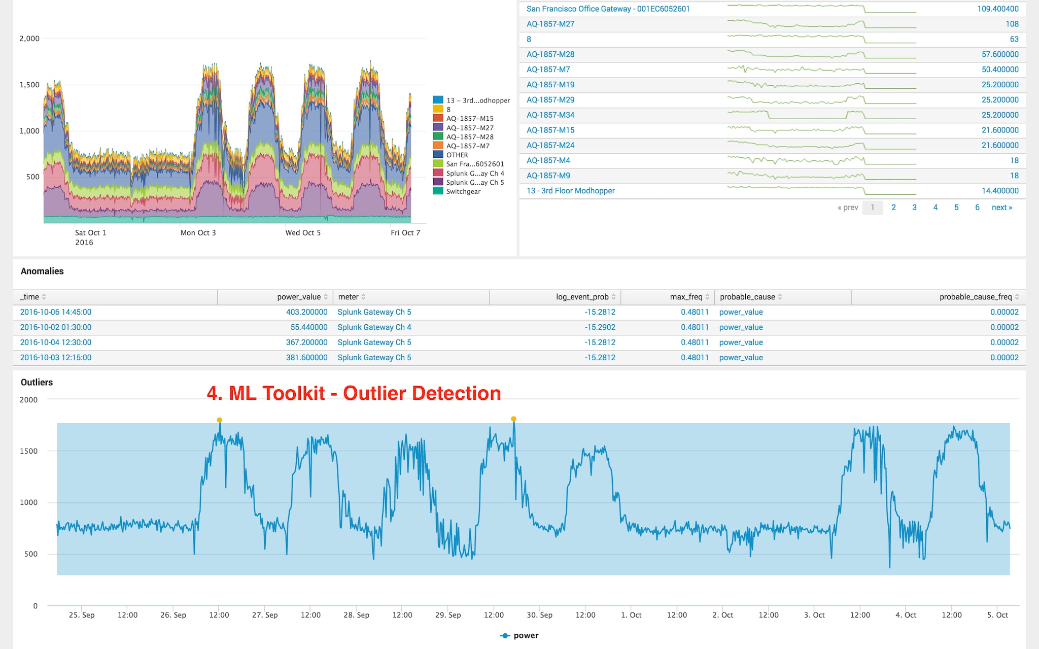
4. Machine Learning Toolkit – Outliers Chart
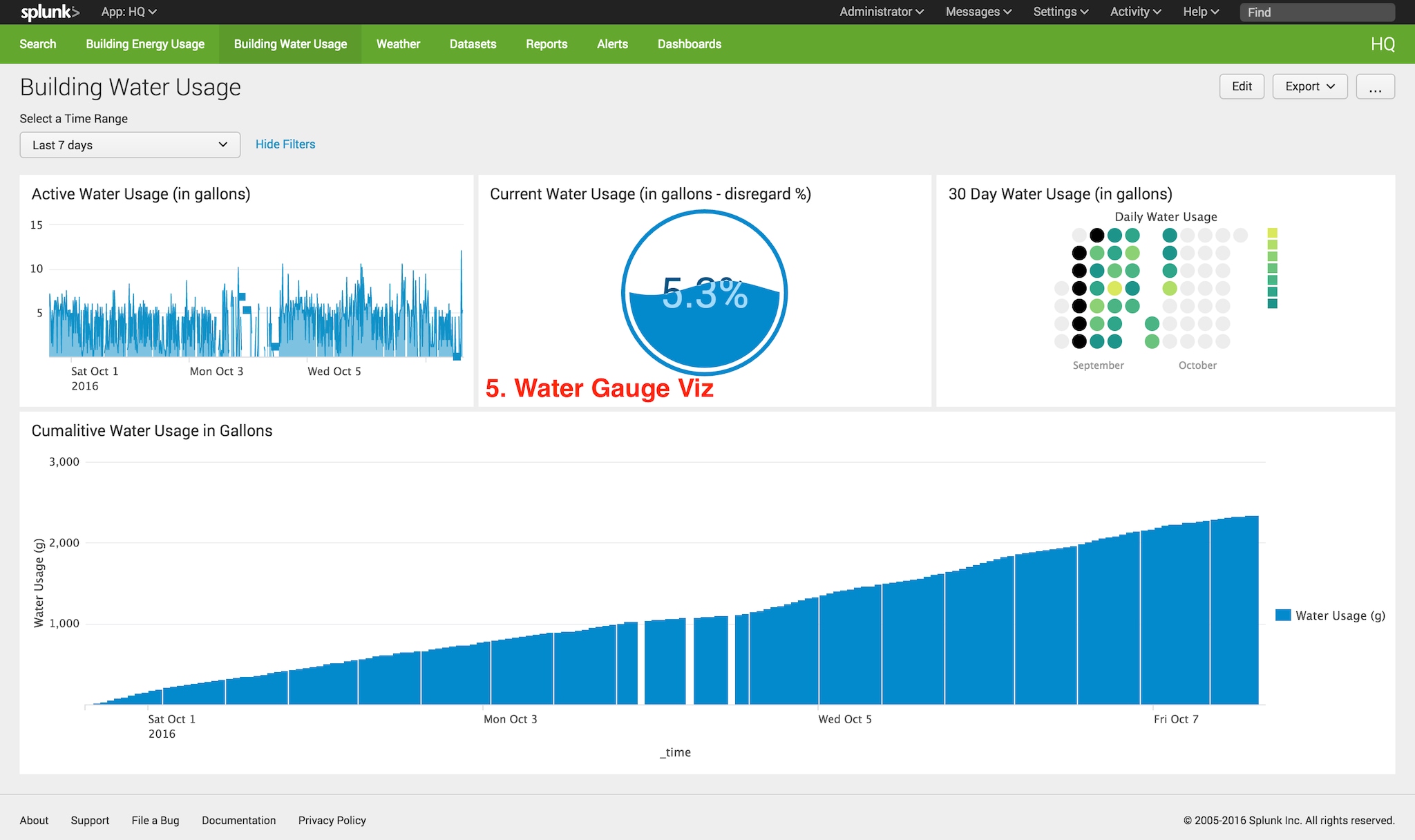
5. Water Guage Visualization
Tips n’ Tricks:
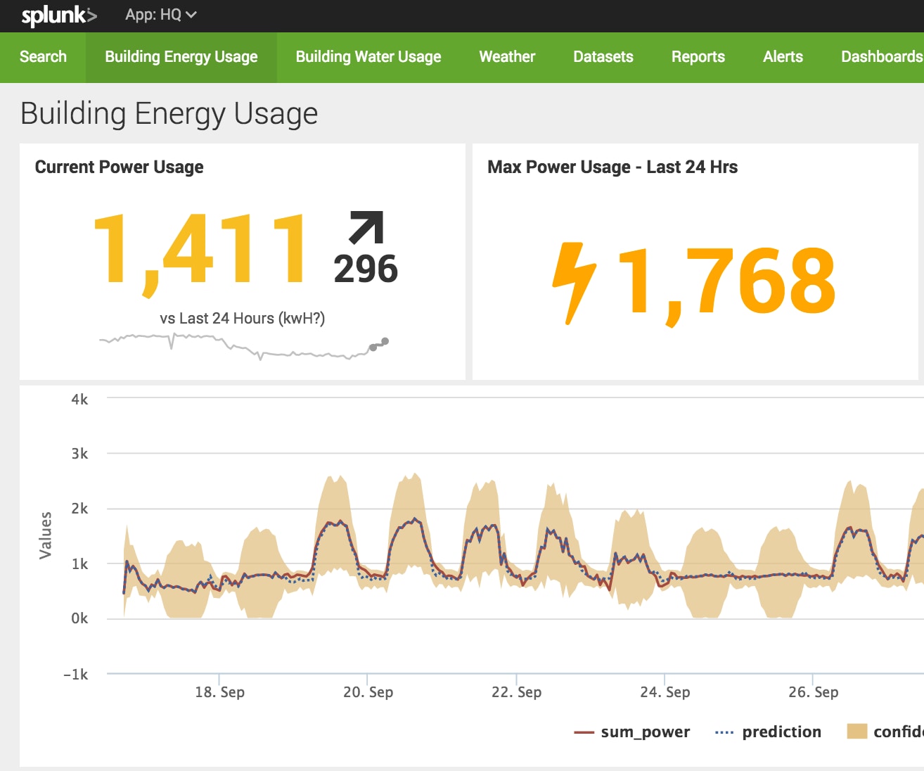
Let’s take a look! This first dashboard is an overall view of energy usage at Splunk. Using some new custom visualizations from Splunkbase I was able to show current/max/avg energy usage as well as a dynamic status icon. The Status Indicator Visualization allows you to pick icons and colors of your choice from fontawesome.io and have them change depending on the values of your data (in this case, an orange lightning bolt for high power usage and a green leaf for average). The best part about these custom visualizations is that they are plug n’ play! No code required.
Next I used the Calendar Heatmap visualization to show overall historic daily power usage. This is nice to look for daily/weekly/monthly trends.
After that I used the machine learning toolkit to both forecast and predict future energy usage as well as look for outliers and anomalies. The SPL command “anomalydetection” is a simple way to detect anomalies whereas the ML Toolkit’s outlier detection is a great way to detect and visualize outliers with custom thresholds.
Lastly I created a simple dashboard to display current and historical water usage. The Water Gauge Viz simply shows the current Water Usage in gallons.
That’s all for this round! Hope you enjoyed and see you next time with another episode of Dashboard Digest Series! Happy Splunking!
– Stephen
----------------------------------------------------
Thanks!
Stephen Luedtke

The Splunk platform removes the barriers between data and action, empowering observability, IT and security teams to ensure their organizations are secure, resilient and innovative.
Founded in 2003, Splunk is a global company — with over 7,500 employees, Splunkers have received over 1,020 patents to date and availability in 21 regions around the world — and offers an open, extensible data platform that supports shared data across any environment so that all teams in an organization can get end-to-end visibility, with context, for every interaction and business process. Build a strong data foundation with Splunk.

Get the latest articles from Splunk straight to your inbox.
© 2005 - 2024 Splunk Inc. All rights reserved.
