Digital Resilience Pays Off
Download this e-book to learn about the role of Digital Resilience across enterprises.

The evolution of the monitoring space is being driven by two key trends. First, applications are being re-architected to take advantage of cloud services and ephemeral or elastic infrastructure. Second, the silos between development and operations are being broken down in favor of the democratization of data and insights across the organization.
Designers of modern monitoring tools must therefore confront several new challenges. First, we must accommodate data that is growing in volume and variety, with a constantly changing lifespan. Second, we must accommodate a wider spectrum of users in terms of their knowledge of monitoring solutions and familiarity with operations.
SignalFx offers users the power and flexibility to visualize anything from service-wide patterns and trends to investigating individual issues at the host, AWS instance or Docker container level. We’re working hard to make sure that this power is accessible to new or occasional users, without limiting the flexibility and efficiency of expert users. Furthermore, we are creating paths to help our novice users quickly gain the expertise needed for increasingly advanced use cases.
To achieve this balance, we’ve focused on two parallel efforts:
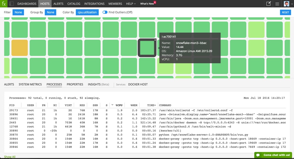
Getting up and running with a new monitoring product can be a challenge, especially given the vastly different system configurations and data models of today’s architectures. So we needed to build a feature that would not only provide users with clear and immediate feedback that data from each individual host is reporting and coming through, but also continues to give an overall view of the health of the environment as their system continuously evolves.
This is where Host Navigator comes in. As your environment begins reporting data, you see each individual host, AWS instance or Docker container come up on the screen. Color the incoming data based on a specified infrastructure metric, and the Host Navigator immediately updates the color of each host to indicate whether its value is low or high. Drill down by filtering or grouping on the dimension of your choice, such as AWS region, service cluster or integration version, and see your hosts immediately rearrange themselves accordingly. Leveraging SignalFx’s dimension-driven model allows you to customize the display to the group or metrics you are focused on.
Click on any host and instantly see its properties or the processes running on it. Use the built-in System Metrics tab to see aggregate statistics that describe your entire population, or the sub-group you selected, streaming in real-time. Right out of the box, you’re gaining better visibility into your infrastructure.
Moving past out-of-the-box visibility, we made it easy to take the next step towards uncovering unexpected behaviors or emerging trends within your system. Now, without any additional configuration, you can quickly identify outlier behaviors that may require your attention.
Turn on the ‘Find Outliers’ feature and we statistically analyze your entire population, take into account your grouping, and clearly mark outliers based on your chosen metric. Instantly see which machines are using up the most infrastructure resources, such as memory, disk space, or CPU utilization.
But monitoring is not just about transparency and observability – you want intelligent alerts to notify you before something goes awry. Next to every group of hosts, we added a small bell icon. Simply click the icon to access a menu of Recommended Detectors. For those just getting started, take advantage of a selection of ready-made detector templates or alert detectors previously created by your team. For those with a more advanced use case, create powerful custom detectors that leverage dynamic thresholds and complex analytics with just a few clicks.
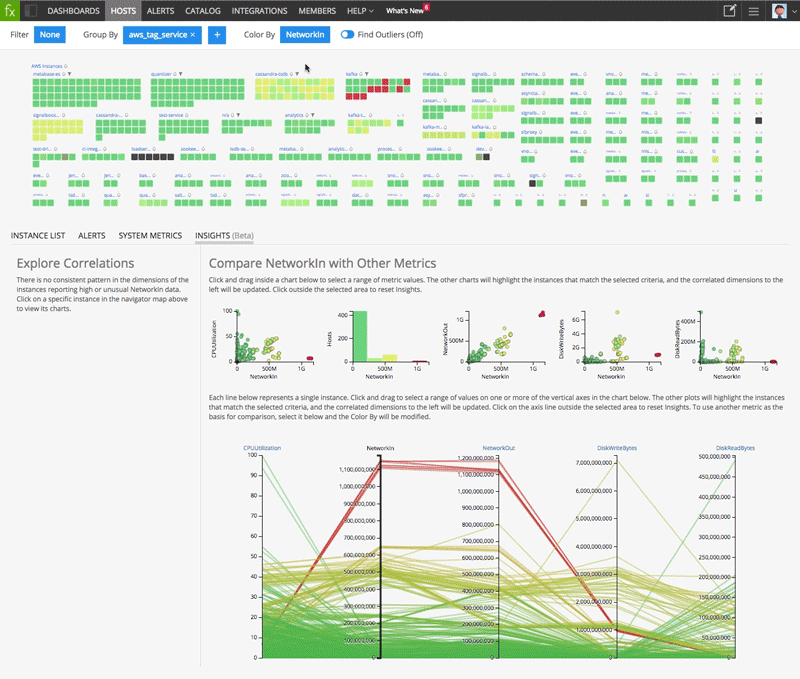
While Host Navigator’s built-in dashboards and charts give you a view of system metrics or alerts for any host or group of hosts, we wanted to help you go further and push the boundaries of how you see your data and the relationships among that data.
Our Insights feature (in beta) helps you discern patterns and relationships between metrics, exposing correlations that otherwise would be invisible. This data-dense visualization of your infrastructure gives a sense of how hosts compare with each other along multiple infrastructure metrics. Hosts exhibiting unusual data patterns naturally begin to emerge.
This is one place where we used interactivity to help you unpack the massive amounts of data. Hover over any host or group in the Host Navigator above and the corresponding elements in the Insights charts will be highlighted.
Spot an anomaly in one of the insights charts? Highlight the region with unusual hosts and we’ll instantly refocus all the data visualizations on those hosts. At the same time, our powerful analytics engine determines which properties best describe the relationship across the selected hosts. The complex mathematical models that uncover these correlations are exposed through a simple list, allowing any user to drill down on any particular property for additional details and deeper investigation.
Having an instant snapshot of your environment provides the baseline to understanding performance across your rapidly evolving infrastructure. But soon you’ll want to start using our powerful analytics to create custom visualizations tailored to your specific needs. For novice users, this process must have a low barrier to entry and be lightweight to allow for rapid, low-cost experimentation. For experts, the same lightweight design enables fast-paced investigation in response to unexpected issues.
Wherever you happen to be in the product, a new, blank dashboard and all metrics from your environment are one click away. Just click the ‘New Dashboard’ button in the top navigation bar.
But a blank starting point for investigation can be intimidating, and the complexity of different data models and elastic infrastructures means that finding exactly what you want can be complicated. Speaking with our users, we’ve learned that most organizations often use a few key dimensions or filters to quickly narrow down the metrics space and then find what they want.
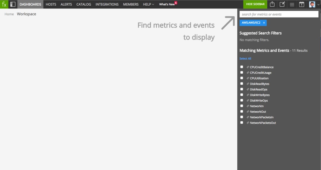
The ‘Metrics Finder’ suggests common dimensions to narrow down to the metrics and events most relevant to you and displays a prioritized list of dimensions customized for your organization. The flexibility of our multidimensional data model means you have access to both the depth and the breadth of data from your environment. Search broadly for all hosts in your environment or drill down on a specific host name to find matching metrics.
Once you’ve narrowed down the results set to what’s relevant for your investigation, click on any metric and ‘Add Charts’ to any dashboard. Creating a new dashboard can be done in seconds, making it much easier to rapidly explore data across your environment or experiment with data visualization. Click the ‘fx’ button on any chart to customize it with powerful analytics and a multitude of visualization options.
We’ve worked hard to ensure a seamless experience for users to quickly work through various data models and analytical scenarios in order to better understand the behavior of their environment. The powerful SignalFx engine applies analytics at data ingest. This means that users waste no time waiting for calculations to complete or charts to render and instead allows users to quickly manipulate data to find the insights needed for troubleshooting.
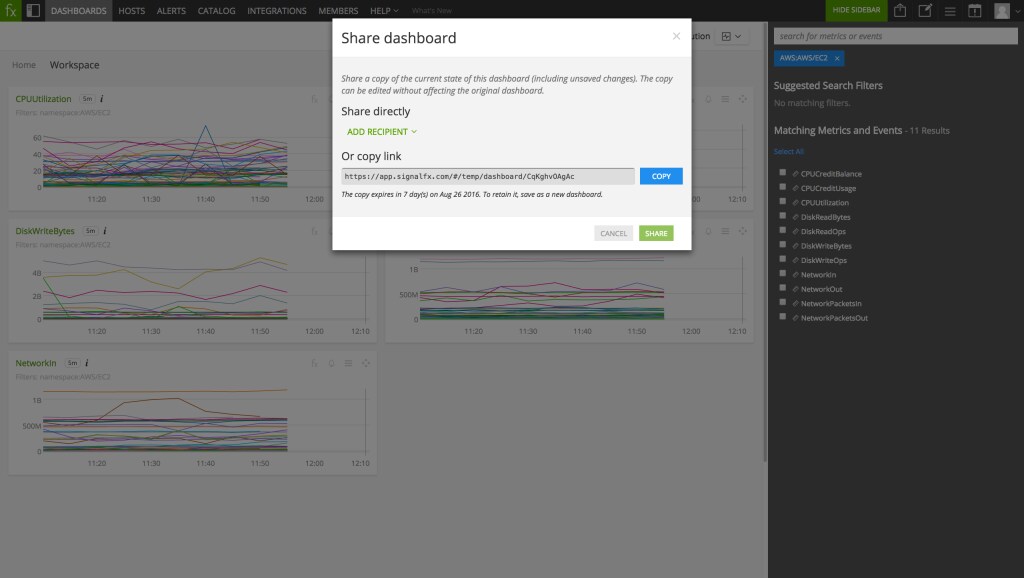
Troubleshooting is a team effort. When one person notices an anomaly, she puts together a few charts before others join in to further explore and diagnose the issue. We know it’s not enough to share a link to a static dashboard – different users need the ability to explore in parallel, to try out different approaches, and to investigate various angles of the issue before understanding the root cause.
To support the need for seamless collaboration, we’ve added the ability to quickly share any dashboard or chart with your colleagues. Providing a starting point for investigation through a copy of your dashboard means that multiple users can gain deeper understanding without interrupting each other or affecting the original insight. Pass information back and forth in a collective effort so no time is wasted for users to start experimenting and interacting to resolve the issue.
Getting comfortable with a new tool takes time, motivation and resourcefulness. But even as the monitoring space gets more complex, it’s our duty to make that process as quick and painless as possible, ensuring that our users get up and running quickly with the core monitoring use case without friction or frustration. But beyond making it immediately accessible, we want to help you learn as you go, so you can get past the core use cases and start leveraging the full power and flexibility of SignalFx. And we want to do all this without slowing down or restricting the expert users, for whom every extra keystroke counts and customization is key.
Stay tuned for more releases – we’re already working on the next set of improvements to SignalFx and we’d love to hear what’s most important to you.
Find your signal today »
Thanks,
Eyal Ophir

The Splunk platform removes the barriers between data and action, empowering observability, IT and security teams to ensure their organizations are secure, resilient and innovative.
Founded in 2003, Splunk is a global company — with over 7,500 employees, Splunkers have received over 1,020 patents to date and availability in 21 regions around the world — and offers an open, extensible data platform that supports shared data across any environment so that all teams in an organization can get end-to-end visibility, with context, for every interaction and business process. Build a strong data foundation with Splunk.

Get the latest articles from Splunk straight to your inbox.
© 2005 - 2024 Splunk Inc. All rights reserved.
