Dashboards Beta v0.6: O.M.G. Oh My Grid (Layout)
If you’re new to the Dashboards Beta app on Splunkbase and you’re trying to get started with building beautiful dashboards, the "Dashboards Beta" blog series is a great place to start. This Dashboards Beta app brings a new dashboard framework, intended to combine the best of Simple XML and Glass Tables, and provide a friendlier experience for creating and editing dashboards. Read more about this new dashboarding framework, or catch up on the previous post in this series about SVG choropleth maps in the Dashboards Beta app.
This post will cover when to best use the new Grid layout in the Dashboards Beta app, how to use Saved Searches as a data source, how to enable or disable the progress bar on visualizations, and how to export a single visualization to a PNG file. For notes on every feature, see the release notes on Splunkbase.
Grid Layout
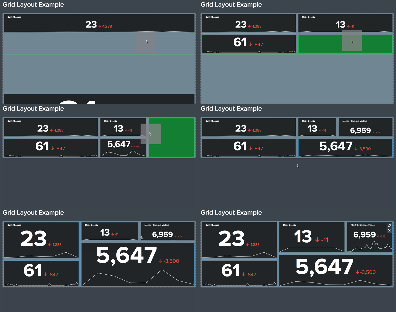
Until now, you've used the Absolute layout for your dashboards, which gives you pixel perfect control of every dashboard component, and allows for more story-telling elements on your dashboard, such as icons and text boxes. But if you don’t have the time or need for pixel perfection, and still want to make sure the charts on your dashboard look good, use the Grid layout! Grid layout allows you to quickly add and organize visualizations on a dashboard in a presentable way, right out of the box.
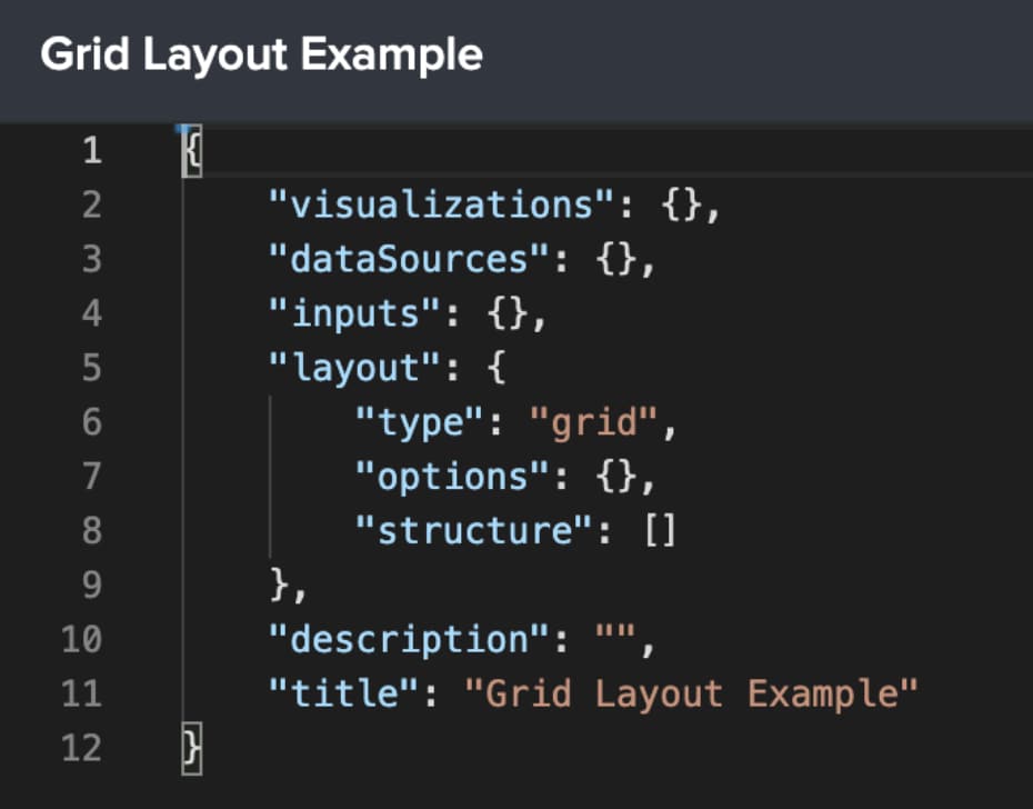
When you create a new dashboard, you’ll be prompted to choose Absolute or Grid layout, and that choice will be reflected in your dashboard definition (accessible via source mode). We do not recommend changing the layout type after you’ve populated a dashboard with content, as many features are not one-to-one between the two layout types. You can see a more comprehensive comparison in the Splunk Dashboards Beta docs.
Add charts, and then drag and drop them wherever you’d like. Resizing and snap-to-grid happens automatically, relieving you of the need to ensure everything lines up just right.
Use Saved Searches as a Data Source
Version 0.6 of the Splunk Dashboards beta app is also introducing the ability to use Saved Searches (also known as Reports) as a data source. Saved Searches allow you to save a Search definition to be run again on-demand or on a schedule.
Once your Saved Search is created, you can add it as a data source to your dashboard in source mode. The data source type is ds.savedSearch and the specific Saved Search you want to use is referenced by name as the ref parameter (exactly like in Simple XML dashboards) in the options section.
To reference a Saved Search from a specific app, add the app parameter under options to specify the app, and ensure permissions are set appropriately! By default, this will look for Saved Searches in the Search & Reporting app context. Check out the docs on Saved Searches as a data source to learn more.
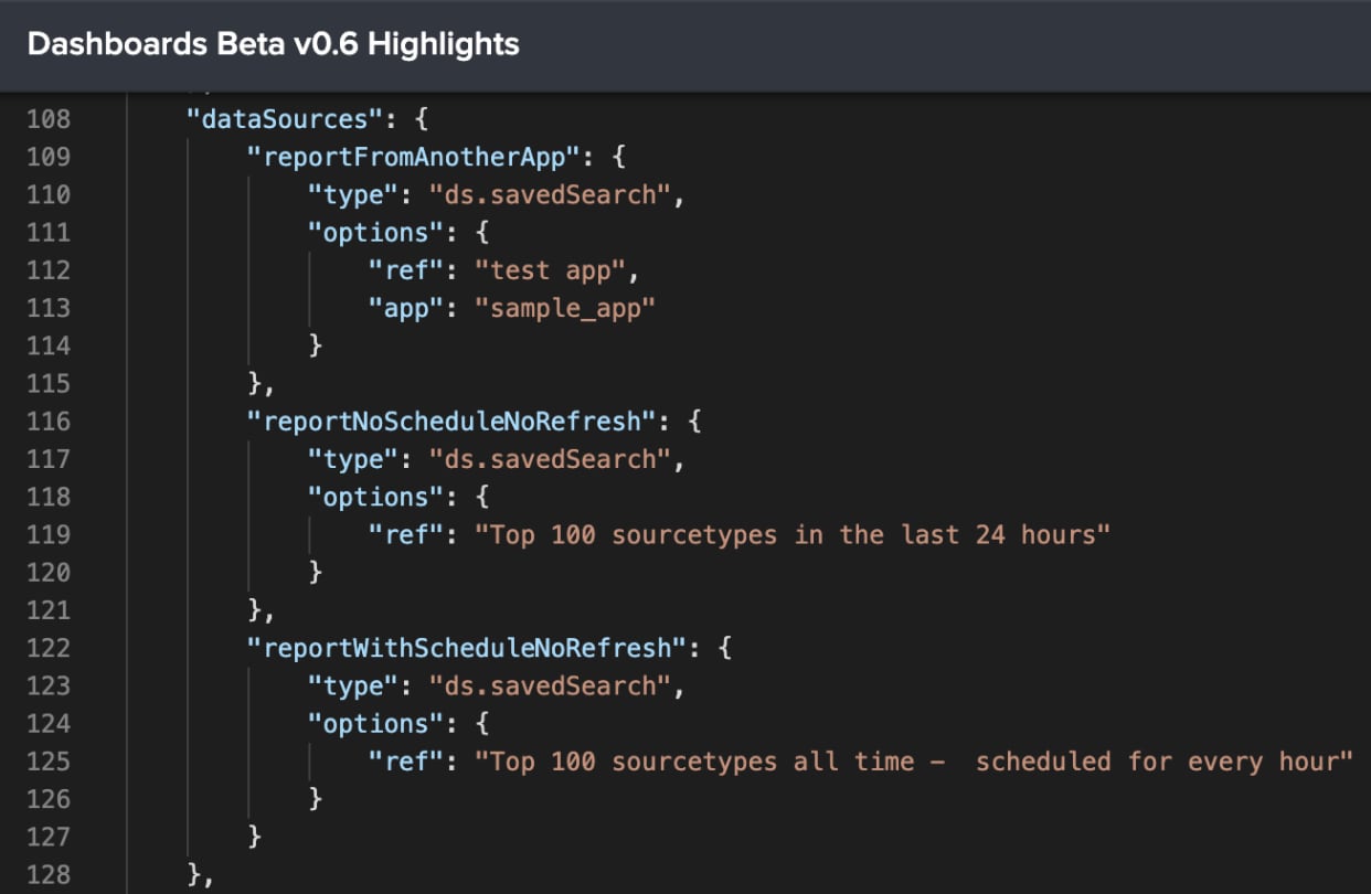
You can use Saved Searches both with and without a schedule. If there is no schedule, Splunk will run the search at the time of visualization. If there is a schedule defined, Splunk will query the latest results instead of running the search.
Progress Bar
So now you’ve been able to quickly set up a dashboard with Grid layout and added a bunch of charts powered by Saved Searches, and you’re so excited to view your dashboard, only to see:
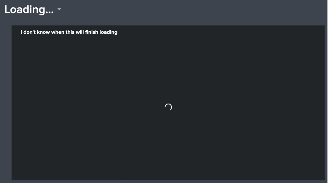
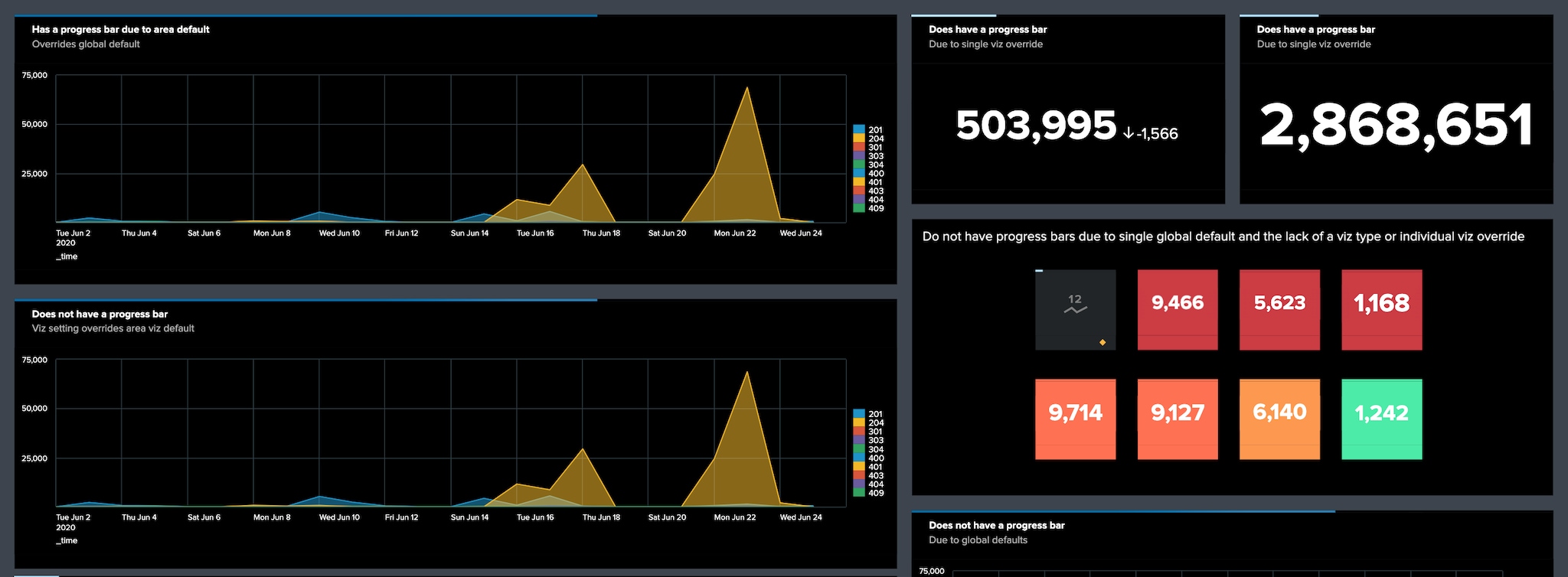
The days of having a loading indicator with no real indication of search progress are over! You can now choose whether you want to show a progress bar at the global, visualization type, and specific visualization levels.

Below is a snippet of the source mode definition for the example “Progress Bar Demonstration” dashboard above.
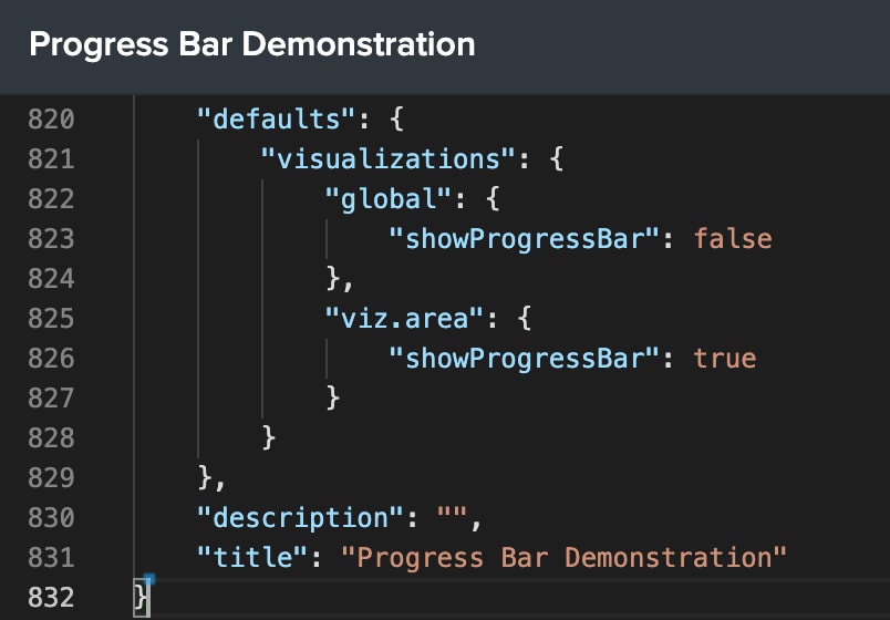
The defaults section sets the global setting for showProgressBar as “false”, and the area chart default for showProgressBar as “true”. This means that area charts will show the progress bar by default, but other charts will not.
You can also set showProgressBar on an individual visualization. The source mode snippet below has two visualizations: one area chart and one single value. The area chart will show the progress bar by default because of the viz.area setting in the defaults section. The single value visualization will also show the progress bar because we’ve specified showProgressBar to be “true” for it.
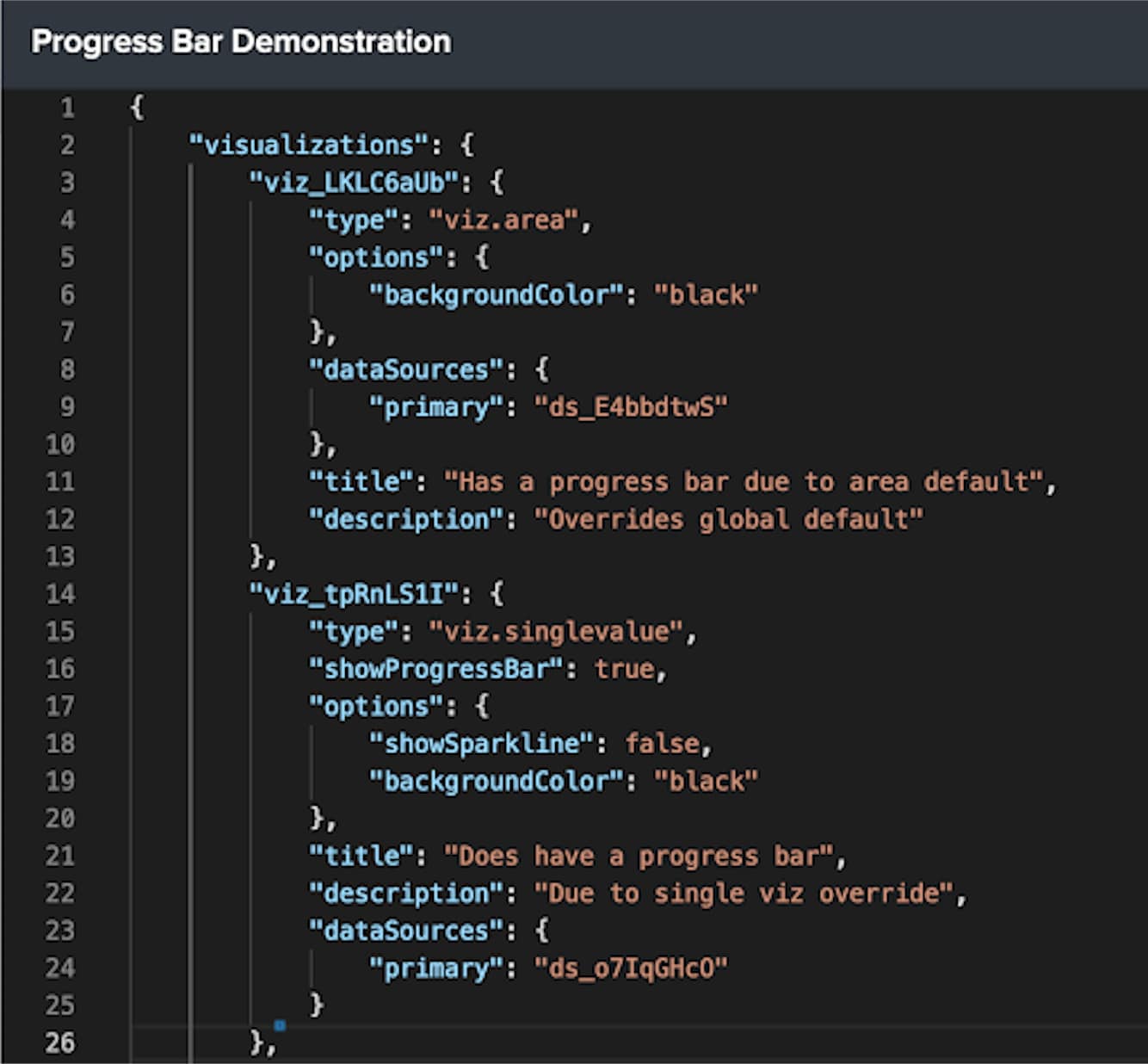
A specific visualization setting will supersede the visualization type setting, which will supersede the global setting.
Export Single Visualizations as PNG
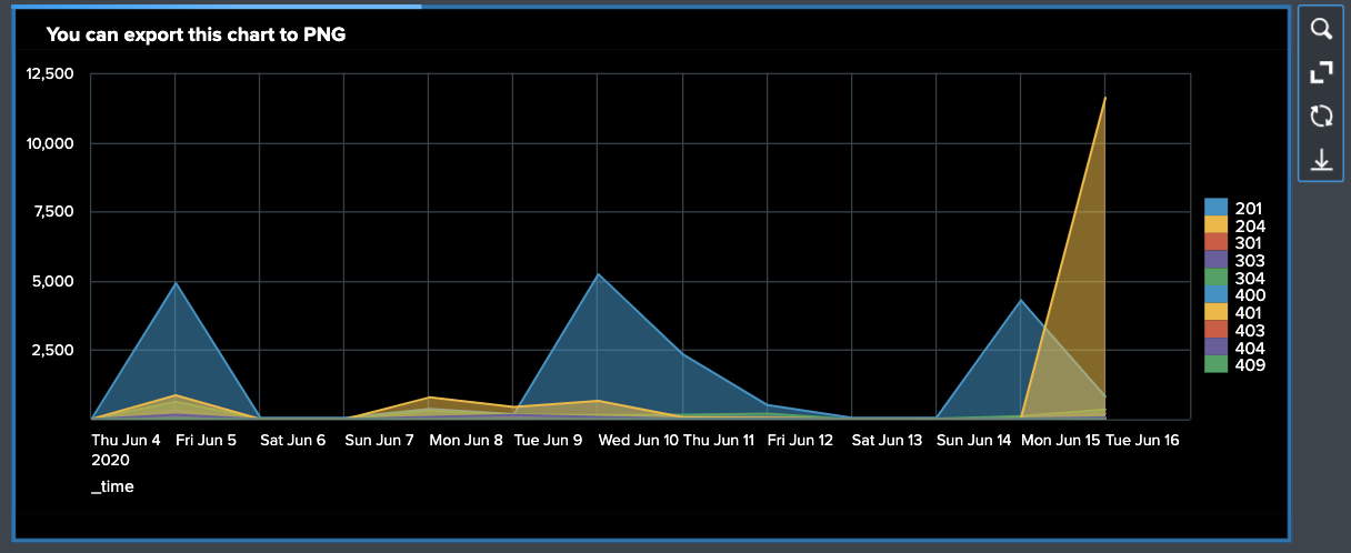
Finally, the moment arrives when the progress bar reaches 100% and right before your eyes lies a beautiful chart powered by a Saved Search. You can now export this visualization to share as a PNG. Select the chart you want to export and look for the download icon in the menu options. Click to download, share, and await kudos for that cool chart you just built.
Coming Soon
- Whole dashboard on-demand export to PDF and PNG. We knew you were going to ask, so don’t worry, it’s coming!
- UI controls for adding and configuring inputs and tokens.
Try out the Dashboards Beta app and let us know if you have any questions, enhancement requests, or bugs to report at dashboards-beta@splunk.com and our team will be sure to respond!
*This information is subject to change at any time, at the sole discretion of Splunk Inc. and without notice. This roadmap information shall not be incorporated into any contract or other commitment. Splunk undertakes no obligation to either develop or deliver any product, features, or functionality described here.
Related Articles
About Splunk
The Splunk platform removes the barriers between data and action, empowering observability, IT and security teams to ensure their organizations are secure, resilient and innovative.
Founded in 2003, Splunk is a global company — with over 7,500 employees, Splunkers have received over 1,020 patents to date and availability in 21 regions around the world — and offers an open, extensible data platform that supports shared data across any environment so that all teams in an organization can get end-to-end visibility, with context, for every interaction and business process. Build a strong data foundation with Splunk.


