Dashboards Beta v0.5: SVG Choropleths Unleash Your Inner Picasso
Welcome to the second installment of the Dashboards Beta blog series! I’m your host, Aditya Tammana, and today we have a very special guest – v0.5 of the Dashboards Beta app on Splunkbase!
If you don’t already know about the Dashboards Beta, I have some pretty exciting news that I sure hope will knock your socks off: Splunk has a brand new dashboarding framework in beta that is meant to combine the best of Simple XML and Classic Glass Tables with pixel-perfect layouts, UI-driven canvas editing experiences, images/shapes/icons, modern visualizations, and much more. If this is the first you’re hearing of this, feel free to read about this dashboarding investment, read the first blog post of the series, and watch Splunk’s own Stephen Luedtke show the power of the new framework in this .conf19 tech talk (which inspired this blog post’s title).
If you have any questions, enhancement requests, or bugs to report, please email dashboards-beta@splunk.com and our team will be sure to respond!
This blog post will cover the highest-impact features in the release; in particular, we’ll talk about Choropleth SVGs, dashboard defaults, and changing font sizes for single values. For notes on every feature, see the release notes on Splunkbase.

SVG Choropleth Visualizations
Ok, this one is super cool. Have you ever looked for an easy way to hook up an SPL query to your own custom maps without creating complex d3.js visualizations – for example, a campus map, a data center, or network map? The Dashboards beta now supports a brand new visualization type, the SVG Choropleth, which allows you to do just that! You’ll now see a brand new visualization type — SVG Choropleth — in your visualizations menu:

This visualization is compatible with any SVG that has a path element with the d attribute defined, which determines the shape of any SVG by defining its pixel-by-pixel outline. Each path can map to a single controllable area in the SVG. For instance, say we’re looking to measure network connection traffic (TCP/IP connections per hour) on a campus map SVG below, and conditionally color each building based on the traffic volume. Let’s use building RF-420 at the top of the map as our working example.

We want this SVG to have 10 different paths, each with its own d attribute, which defines the areas of the 10 different buildings. You can create such SVGs with many publicly available design or open-source tools. In order for Splunk to understand the boundaries set by the d attribute, each path must have a unique id attribute as well. The path below for building RF-420 building uses an id named “RF-420”, with an outline defined by d. Learn more about SVGs here.

In order to hook up SPL to this particular path, the (tabular) result has to map to the id so that each path has a numerical value associated with it. For example, a query that results in a table with 2 columns (say, Building Name and Count) and 10 rows (one for each building) lets us map each building to a numeric result, provided that the SVG path id matches the Building Name for any given row. In this case, one of the Building Names would have to be “RF-420” in order for that area to populate from the query. Sample table below is not showing real data.

In order to choose what colors are shown based on the numeric value of each path, we can then leverage a concept that already exists in the dashboard beta: encoding. Encoding allows for coloring of visualizations, charts, numbers, shapes, and more. You can choose which table columns to use for the featureId and the value using the featureId and value fields in encoding, and use the rangevalue format type to choose the coloring style. Defining those ranges is then straightforward:

This all comes together beautifully with a custom SVG powered by SPL to conditionally change colors based on query results. It’s cool, we know.

Dashboard Defaults
With the v0.5 release, there comes a new JSON stanza: defaults. This sets controls that affect the entire dashboard, per-type. Two features come with this in v0.5: the first is the ability to globally control all dashboard refresh rates, and the second is the ability to cancel searches in progress when navigating away from the dashboard in the browser.
The dashboard beta now allows you to determine the refresh rate for all searches centrally, instead of setting refreshes on each dataSource itself.

In addition, it also allows you to cancel searches on the dashboard when a user navigates away from the browser tab in order to not continue running searches that aren’t being actively viewed.

Single Value Font Sizes
You asked, we built it. We heard your complaints about SV and SVR visualizations conflicting with the number shown in the visualization. We're happy to introduce two new options: majorFontSize and deltaFontSize, which allow you to customize how these look on any dashboard - bigger or smaller, to fit into your context!

Coming Soon
So...what can you look forward to, you ask? Let's give you a sneak peek at what's coming down the pipeline in the near term.
- Grid Layout. Loving the absolute pixel-perfect layout, but looking for an easier way to get quick, easy alignment on dashboards without messing with the pixel-by-pixel positioning? Well then, you'll love this. The new grid layout will allow for intuitive canvas formatting when a beautiful, executive dashboard isn't your primary goal.
- Reports as a dataSource. Your saved searches and reports are welcome here. On deck is a new dataSource type to support reports/saved searches to power your dashboard, and use it as a base search if you so choose.
- On Demand PDF/PNG Export. Pixel perfect on-demand content export is coming soon! Click, download, and voila.
*This information is subject to change at any time, at the sole discretion of Splunk LLC and without notice. This roadmap information shall not be incorporated into any contract or other commitment. Splunk undertakes no obligation to either develop or deliver any product, features, or functionality described here.
That's it for this edition of the Dashboards Beta series. As always, take a look at release notes for a full set of features, bug fixes, and more. If you have yet to download the Dashboards Beta app, check it out on Splunkbase. We have some super fun functionality coming out in the next quarter...keep an eye out for even more enhancements!
Related Articles

Announcing the General Availability of Splunk POD: Unlock the Power of Your Data with Ease
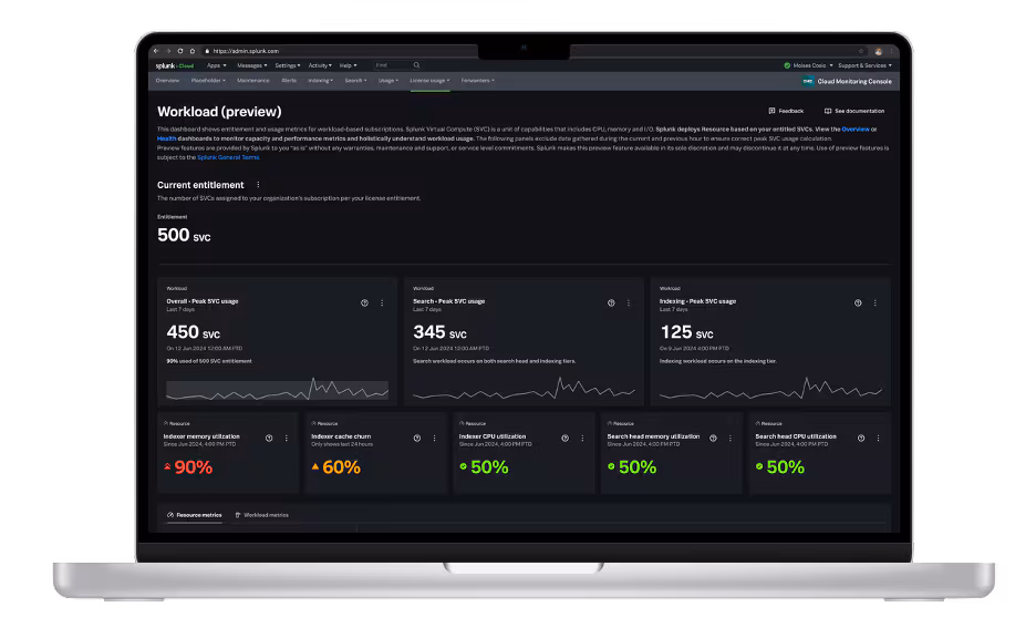
Introducing the New Workload Dashboard: Enhanced Visibility, Faster Troubleshooting, and Deeper Insights

Leading the Agentic AI Era: The Splunk Platform at Cisco Live APJ

Dashboard Studio: Token Eval and Conditional Panel Visibility
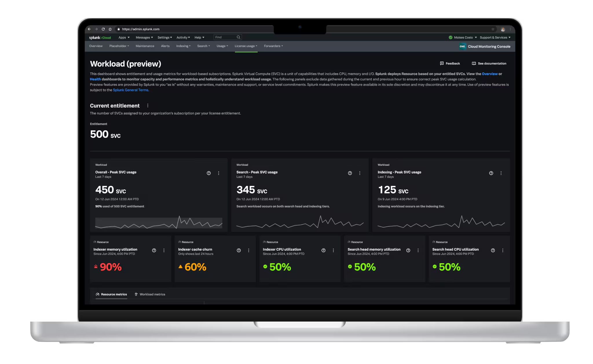
Introducing Resource Metrics: Elevate Your Insights with the New Workload Dashboard

Powering AI Innovation with Splunk: Meet the Cisco Data Fabric

Remote Upgrader for Windows Is Here: Simplifying Fleet-Wide Forwarder Upgrades
Dashboard Studio: Spec-TAB-ular Updates