Dashboard Studio: Dashboard Customization Made Easy
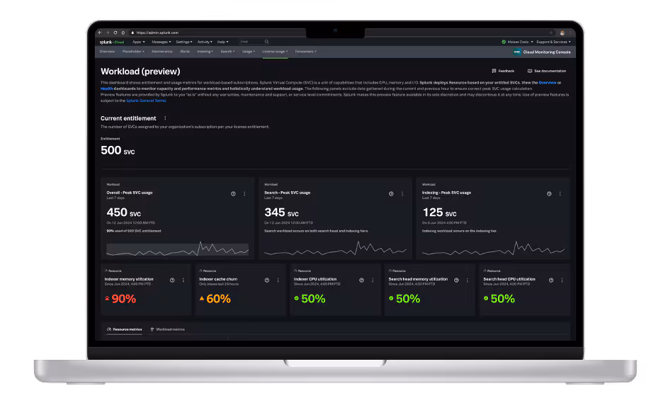
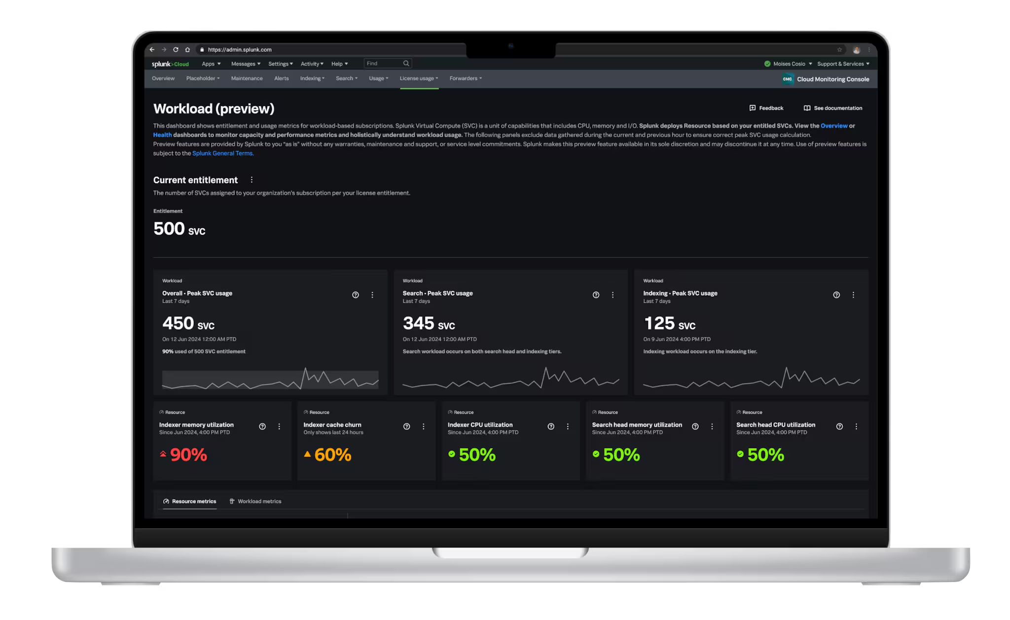
Do you wish it were easier to customize your Splunk Dashboards so they could look like this:

Yes? Great, you have come to the right place! In this blog post, we will examine common dashboard customization use cases and how they can be achieved more easily in the new Dashboard Studio than with Classic (Simple XML) or HTML dashboards. Dashboard Studio is a dashboard-building experience that offers advanced visualization tools and fully customizable layouts to easily create visually-compelling, interactive dashboards with an intuitive UI.
Common Dashboard Customization Use Cases
If you look through Splunk Answers, our community forum, you will find nearly 500 questions about customizing Splunk Dashboards. That's because it's not easy to customize Classic Simple XML dashboards. In order to add background images, customize the layout of visualizations, add text boxes for static information, or change chart colors, you have two options:
- Implement and maintain your own custom extension of Simple XML using custom JS or custom CSS
- Convert to HTML

Both options have the drawbacks of requiring custom development and the overhead of maintaining the dashboards, especially if they break between Splunk versions. HTML dashboards have the additional drawback of not being able to use the editor UI or schedule for email delivery. Additionally, as of Splunk Cloud 8.2.2105 and Splunk Enterprise 8.2, HTML Dashboards are deprecated. If you choose to continue to use HTML Dashboards, they may require manual updates if they break between upgrades.
However, now with Dashboard Studio, included in all releases starting with Splunk Cloud Platform 8.1.2103 and Splunk Enterprise 8.2, many of your dashboard customization needs are possible out-of-the-box as native capabilities! Let's look at a few examples.
Customize the Dashboard Layout
Dashboard Studio comes with two layout options that give you a lot of flexibility when it comes to customizing how your visualizations are displayed: Absolute and Grid.
You can think of Absolute layout like a free-form canvas where you can place visual objects wherever you would like. This is great when you need pixel perfect placement or layering objects on top of each other.

Grid layout provides snap-to alignment and automatic resizing when you move visualizations around. This means Grid layout is a great option when you just need to quickly create neat dashboards.

Change Chart Colors
In Dashboard Studio, you can now adjust your chart's colors, either through the UI or in the source code (in which case, we are working on UI!). For Single Value, Table, and custom Choropleth SVGs, you can specify the HEX colors you want to use in the UI. You also have a selection of predefined color palettes you can choose from.

For the remainder of the visualizations, such as area charts or bar charts, you can specify the colors you want to use in the source code. You can specify a palette of colors, or you can specify which color should be used for which field. If you are just specifying a palette of colors, you will add an option called "seriesColors":
"options": {
"seriesColors": [
"#A870EF",
"#A9F5E7",
"#F29BAC",
"#26AA92",
"#FDAF93"
]
}
If you would like to specify which color should be used for which field, you will add an option called "fieldColors":
"options": {
"fieldColors": {
"1": "#A870EF",
"2": "#A9F5E7",
"3": "#F29BAC",
"4": "#26AA92",
"5": "#FDAF93"
}
}
If you want to apply the same colors to multiple visualizations, you can leverage the dashboard "defaults" section. For example, instead of specifying the series colors for each individual area chart, you can move those options to the "defaults" stanza in your source code, which will look something like this:
"defaults": {
"visualizations": {
"viz.area": {
"options": {
"seriesColors": [
"#A870EF",
"#A9F5E7",
"#F29BAC",
"#26AA92",
"#FDAF93"
]
}
}
}
Add Images (and Gifs) and Text Boxes
With Dashboard Studio, you can directly upload images to use in your dashboard (note: images are currently only supported with Absolute layout). When you upload a background image, you can also adjust its scale. Dashboard Studio supports additional images, which you can use for adding your corporate logo or even gifs for animated images. You can upload them directly, as shown in the gif below, or you can add them via a URL.

You can also add text boxes to Dashboard Studio (currently only available with Absolute layout) to provide static information or more context about the dashboard.
Add Shapes and Layer Objects
With Absolute layout in particular, there are some features that will take your dashboard to the next level. You can add shapes and lines which allow you to visually group objects together, provide a layer between a visualization and the background, and connect objects together.
As you can see from this E-Commerce & Monitoring dashboard, white boxes are used to provide a buffer between the visualizations and the background, as well as to group many of the single value visualizations together.
Example of a Dashboard as a Landing Page
Now that you know how to customize your dashboards with the native capabilities of Dashboard Studio, imagine using a dashboard as a landing page for your end users to navigate to other dashboards or relevant links. This is actually what we did with the Dashboard Studio Examples Hub pages — they are themselves Studio dashboards with drilldowns to other pages!

Next Steps
If you would like to see Dashboard Studio in action and have a step-by-step walkthrough of the capabilities, we encourage you to watch the demo and for more details explore the resources below.
We hope you love Dashboard Studio as much as we do! If you try it, please send us your feedback at dashboard-studio@splunk.com!
Resources
- Splunk Dashboard Studio Documentation
- Dashboard Studio Tech Talk
- Splunk Ideas - Dashboard Studio for feature or enhancement Requests
- Examples Hub - Find the Examples Hub from the Dashboards page in Search & Reporting
- Splunk Community - Dashboards & Visualizations for questions
Related Articles

Announcing the General Availability of Splunk POD: Unlock the Power of Your Data with Ease
Introducing the New Workload Dashboard: Enhanced Visibility, Faster Troubleshooting, and Deeper Insights

Leading the Agentic AI Era: The Splunk Platform at Cisco Live APJ

Dashboard Studio: Token Eval and Conditional Panel Visibility
Introducing Resource Metrics: Elevate Your Insights with the New Workload Dashboard

Powering AI Innovation with Splunk: Meet the Cisco Data Fabric

Remote Upgrader for Windows Is Here: Simplifying Fleet-Wide Forwarder Upgrades
Dashboard Studio: Spec-TAB-ular Updates