Digital Resilience Pays Off
Download this e-book to learn about the role of Digital Resilience across enterprises.

Early on, we decided that effective chart lines require two main things:
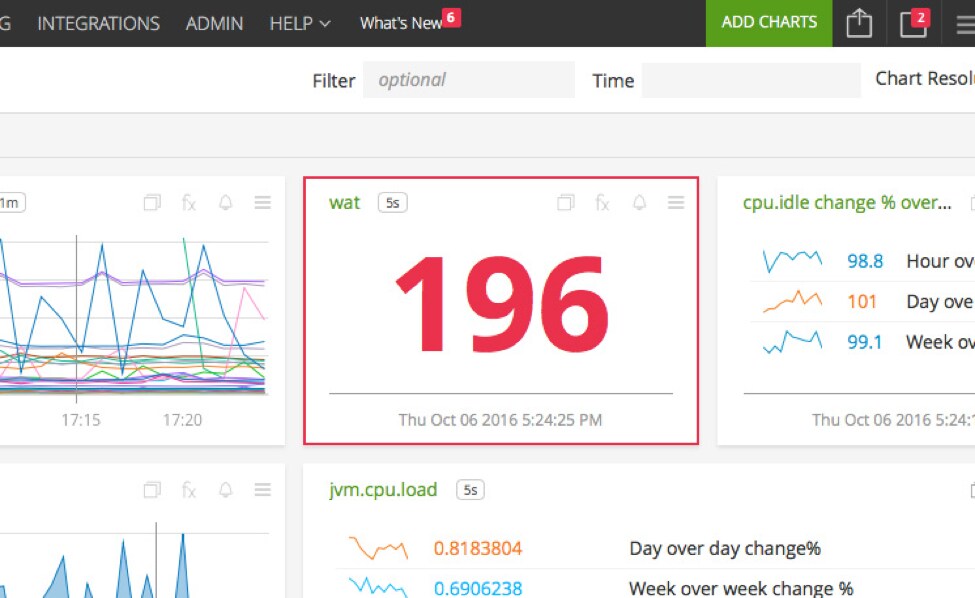
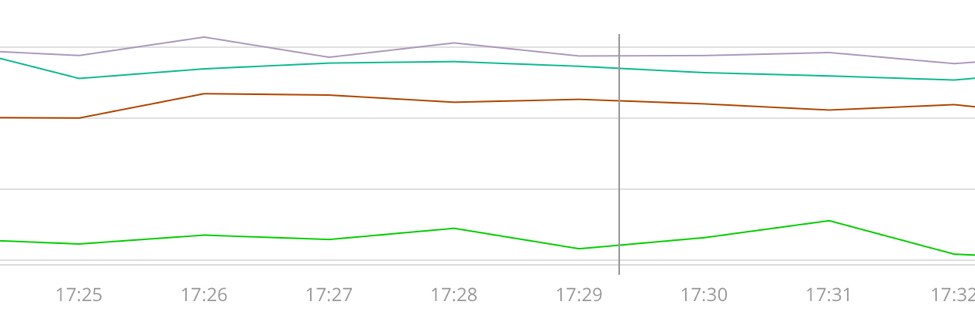
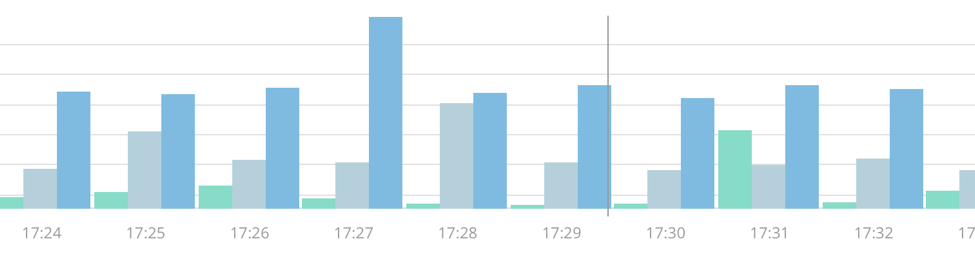
Color distinction is especially important in graphs displaying numerous correlating data side by side and on the same plane. If users are forced to match a hovering tooltip label to a key because they couldn’t tell the difference between two colors, we’re not utilizing the graphical potential of the chart. We aimed to design charts that elegantly display the most information while requiring little to no interaction.
We also preferred that the colors we chose would be flexible in that a color would appear the same in both light and dark environments due to SignalFx’s ability to view charts in both bright and dark themes. We assign a color to the same time series across the app (If the dimension “quantizer-26” is purple in one place, it’s purple every other place as well), so colors are somewhat unique identifiers. There are many colors that have the inherent problem of appearing very differently depending on its background color, but it would have been an inefficient process to manually adjust each color and record an alternate tone or shade dependent on the background. Instead, it’s more efficient to choose a color that is visually stable despite the background.
The tricky part was trying to figure out a starting place less vast than the full spectrum.
We brainstormed with brands, foods, colors used in particular games and toys. Although many ideas worked well in their own ways, we kept hitting a wall when balancing between variety and uniqueness. A gradient between two colors, say green and blue, yield a great many possible colors:
Perceptible distinction begins with decreasing the number of possibilities:

But while you can more easily distinguish the color differences when they are blocks touching side by side, it would still be too difficult to tell the colors apart in their final form (chart lines):

Further reducing the number of color possibilities certainly help, but in this particular case where green and blue are both fairly cool tones, the colors in between are still difficult to tell apart:

And eventually we’re left with the original two points:

A systematic approach to choosing these colors just wasn’t going to work. They had to be hand-picked.
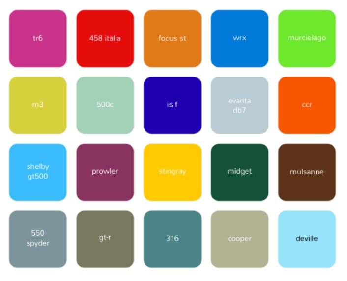
One particular starting point that worked well was the automotive industry. Certain cars usually have a distinct associated color, even in similar hues, that people can oftentimes distinguish. For instance, Corvette yellow is notably different than VW Beetle yellow. Or the Subaru WRX blue versus the Cadillac DeVille blue. Some of these colors are so distinct, the color itself is sometimes reminiscent of a particular car.
So we started with exactly that: noteworthy car colors. And to keep the colors as distinct as possible, we limited each hue to no more than two variants. Two blues, two oranges, two greens, etc. What we ended up with was a total of 18 clearly distinct colors, that if any two of these colors were next to each other on the same chart, you could tell them apart.
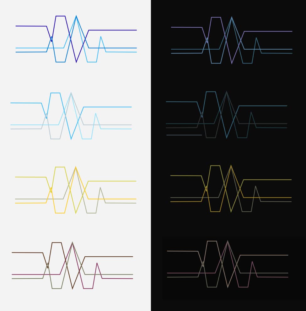
An early example of the color palatte
Next, we fine-tuned the colors’ saturation and brightness levels to optimize the distinction on both light and dark backgrounds. Each color was laid out as simulated graph lines and the colors were adjusted while testing line thickness.
In the final phase, we decided to remove two red hues from the total of eighteen colors to reserve the color red for alert features that would include additional visuals apart from the charts. Red is generally associated with a cause for alarm, and if chart lines or keys were arbitrarily red, it potentially could cause confusion. Yet by the same token, it could be a benefit if red was only used as a means to alert. The exclusiveness would teach the user to respond to red in any situation.
Today, red is not only used to alert the user of problems in the system, but also various things that require the user’s attention. Alerts, notifications, warnings, and potentially unsafe options all proportionally use red as a way to inform the user of the critical nature in the situation.

The sixteen colors we use in our charts are essential in aiding the basic function of differentiating lines.
Because of this, as we continue forward producing new features, we take a great deal of care in how we introduce new colors. In some cases, we even hold back on using colors at all and emphasize an overall minimalist environment so that the user can focus on what’s important: their data.
----------------------------------------------------
Thanks!
Calvin Chan

The Splunk platform removes the barriers between data and action, empowering observability, IT and security teams to ensure their organizations are secure, resilient and innovative.
Founded in 2003, Splunk is a global company — with over 7,500 employees, Splunkers have received over 1,020 patents to date and availability in 21 regions around the world — and offers an open, extensible data platform that supports shared data across any environment so that all teams in an organization can get end-to-end visibility, with context, for every interaction and business process. Build a strong data foundation with Splunk.

Get the latest articles from Splunk straight to your inbox.
© 2005 - 2024 Splunk Inc. All rights reserved.
